Monday, July 25, 2005

Make Happy

Quick post this morning that had to be done. The site in question today is www.logogle.com, which will take any word you input and turn it into a Google-ized logo. I don't need to really spend any time pointing anything out here because the site seems to have been hastily translated from Japanese into Engrish. And though I point it out because of poor usability, I cannot help but also be amused. Here's a screenshot of the main page:


I love how the simpilest of instructions translated from Japanese can sound like the beginning of great Haiku:

"The logo of the Google style is made."

For parting, here is my screen:


7/26 Update - How silly that I didn't think of this until this morning. I'm sure someone out there has already beat me to it, but I'll do it anyway...


Tags: , , , ,

Sunday, July 24, 2005

Polling Point's Poor User Experience

I'm not usually the kind of person that stops to fill out online surveys. Most of the time, I find myself hassled by the unethical way most survey sites offer free drawings in exchange for the right to spam me and sell my email address to the highest bidder. On occasion, though, I break my own rules and do complete surveys. In this case, I got exactly what I expected... something to write about.

This survey, which was conducted by PollingPoint.com, was a simple, straightforward survey. It consisted of three pages of questions about entertainment, politics, religion, etc. It was easy, and it took me two minutes. Once the survey was complete, Polling Point asked for my contact information so that they could send me more poll invitations. Here's the screen:


On the surface, this page is pretty straightforward. However, I have a couple of problems with it. Keep in mind that I try to approach every screen I see like a casual browser, not the developer and frequent web user that I am:

1. What do the asterisks (*) next to the name and email fields mean? I suppose they could mean that those three fields are required, but they aren’t; I can navigate away from this page without filling out anything. But even if they were required, the only web convention for denoting required fields they seem follow is the presence of the asterisk. What they didn’t do was make the asterisk red, place it before the field and place a note at the top of the page communicating as much. But since none of the information on this page is required, I can only assume that the asterisks mean that I should fill out those three fields if I’m going to fill out anything. This is probably not the best way to communicate that information. Even still, since there is nothing on the page to map the asterisks to their purpose, I'm only making an assumption and I could be totally off.

2. I need to be reassured that you’re not going to pimp out my information before I fill out the form. This is nit-picky, I know, but it makes a difference in conversion. Most people are going to miss that note because it’s jammed between the form and the navigation buttons. In addition, the first sentence can be emphasized a bit more. That’s the reassurance the user wants to hear.

But alas, I am not interested in receiving invitations to complete surveys, and since nothing appears to be required, I click the “Next Page” button. Here is the result:

Two thoughts on this page:

1. Never, ever keep a user from navigating away from a page with NO required information. To a casual user, no good can come of this and only confusion will result. “Why am I seeing the same page again, and with lots of red text?” they will ask as close their browser. I should never see red on a page where nothing is wrong and nothing is required. A better solution would be to allow me an opportunity to change my mind and return to this form on a future page.

2. “You may continue to skip entry of this information.” That’s exactly what I was trying to do, isn’t it? So what do I do now? If I click “Next Page” again, will it give me the same message or let me go? This message, which is unclear and grammatically incorrect, isn’t really helping me and I don’t even know exactly what to do until I click “Next Page” again and it actually works. This is not a difficult fix, but changing the text to read “Click ‘Next Page’ to skip entry of this information” can make a big difference.

After clearing the land mines, I am presented with the last form, which, aside from trying to get me to enter a drawing for an iPod mini, actually employs a good method for increasing conversion:


The box to the right, which gives me an opportunity to go back and complete the last form, is the right way to go about this process. Unfortunately, I’ve already gotten a bad taste from being unable to leave the form behind and I won’t be changing my mind this time.

The point of bringing up PollingPoint.com is to illustrate that there is more to a satisfying user experience than slick and simple interfaces. PollingPoint had those, to be sure. But a user will quickly forget about the look of something if they’re having trouble completing a task.

I think it's time I get back to the "Design for Context" series now, so I'll return in my next post with "Ideas vs. Implementation" as promised.

Saturday, July 16, 2005

Kudos to CandyLabs

I want to make sure that, from time to time, I'm giving praise to sites, apps and everyday things that bring happiness to the user locked within me. So that I can never be accused of only seeing the negative, here's one right now...

I was downloading a trial version of AppRocket by CandyLabs this morning, when I was presented with the following on the post-download page:


Some things I like about this page:

1. No attempts to make be buy the full version of the software before I even try the trial. CandyLabs knows that I'd like to try out the application before buying, so they don't bother to try the instant upgrade routine. You'd think that would be common sense, but it's not in this crazy, mixed-up world. Several years ago, I walked into a Bally Total Fitness with the intention of going through a two-week trial. Rather than getting that trial card right away and being left alone for two weeks, I was pitched by a sales guy who told me they'd discount those two weeks off of a three year membership if I signed up that very day. I hadn't even seen the inside of the club yet!

2. No ads. CandyLabs has no interest in keeping me on the site at this point, and that's a good thing. They want to send me skipping off like a kid with a new baseball glove, and I appreciate that. It gives me a positive impression of their business and gears me up to test drive the software.

3. An important message on the page that's actually important. Notice from the image that there isn't much CandyLabs feels the need to say after I've requested the trial download. Here's the text in question:

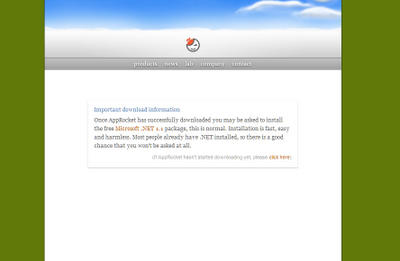
I can't say enough about how useful and friendly this message is. The .NET Framework is in my blood, so you can bet I've already got it installed. But I can also put myself in the shoes of someone who has never even heard of the Framework. I can bet that said individual would find the idea of installing one piece of software and suddenly being asked to install another along with it both annoying and a bit scary. CandyLabs sees this and, not only helps out those customers with friendly, accessible language, but they probably saved a few aborted installs and, therefore, sales.

This is the kind of consideration for customers that I love to see. In addition, CandyLabs gets marketing out of the way and lets the software speak for itself. As long as they never hire marketing reps from Bally Total Fitness, I think they're on the right track.

Wednesday, July 13, 2005

Don't Click It... Or Else!

Here is an interesting site: http://www.dontclick.it/

The goal seems to be to educate us commoners on how ingrained clicking is to our navigation of the web. They do so by promoting and forcing navigation through “gestures” and by removing all click functionality from the site. For example, when I move my mouse over a link, the link is immediately activated.

I said it's interesting, but I hate this site. Here's why:

1. I'll give them that clicking is an ingrained behavior, but why does it need to change? If I change the way that web navigation works, doesn't that run contrary to all other user interfaces (i.e. Windows XP) that rely on click events? I see this like arguing that a steering wheel is a bad control mechanism for a car and we all need to start using joysticks when we drive.

2. From a user experience standpoint, it strikes me as a bad idea to tell a customer that their habits and behaviors are the problem and ask them to change. The key to creating a satisfactory user experience is to recognize that all web use is idiosyncratic and the best we can do is to cater to the 80% of our customers that expect to use our site a certain way. We should never seek to force our customers into a set of behaviors or ways of thinking.

3. I was careful NOT to click, but I accidentally did once after I finished reading something on the site and forgot where I was. After I clicked a link, the entire screen fuzzed as a TV with a bad signal would and I was presented with this message:

"Oops! You accidentally clicked even though there isn't anything to click."

I was forced to stare at this screen while a 10 second countdown clicked away before I was returned to the main interface.

While I appreciate the pavlovian attempt to slap the clicks out of me, I shuddered to think about what a casual user would think about such a thing. I can guess that most casual users would shut the browser down before the countdown had clicked off 5 seconds.

4. It's not practical. If you want to sell me on a different way of navigating a site, do it practically. Put up a pseudo storefront for me to browse products. Show me how easy it would be to add items to my shopping cart. Make me fill out a form so I can see that the "no click" interface makes that simpler. All I got from this site was 5 minutes wasted and something to rant about.

5. It's gimmicky and silly. But hey, they got my attention...

Saturday, July 02, 2005

Design for Context Part II - A real-world example

"Bad design cannot be patched up with labels, instructions manuals, or training courses." - Donald A. Norman, The Design of Everyday Things

A couple of weeks ago, my wife and I ventured to Home Depot for a couple of items we needed in the midst of renovating our master bathroom. What started as a simple job of laying porcelain tile where once there were carpet pieces and linoleum has turned into a complete repainting of the walls, new tile on the counter, new fixtures, etc. That is a story for another day, though.

Our purchase from Home Depot was a typical case of "Going back after the initial trip to get the things you either forgot or didn’t think you actually needed." So we didn’t have a large number of items, maybe 4 or 5 things. When I make a trip like that, I tend to use the self checkout that Home Depot offers. It’s a staple of any grocery shopping experience for us, so I usually gravitate there at Home Depot if I’m purchasing a small number of items.

On the evening in question that my wife and I were there buying 4 or 5 items, we encountered the following:

  • We waited 2 times for human visual verification of items.

  • The system told us 3 times to replace an item in the bags that it felt we had removed when, in fact, we had not removed anything. Human intervention was required to "reset" the system so that we could continue.

  • One item would not scan and required the self-checkout employee to take the item back to her station, scan it for us and then bring the item back.


Keep in mind that we had small items no bigger than would be in your basket at a grocery store. Unfortunately, I’ve found this kind of experience to be typical when I’m buying more than two items at the Home Depot. In addition, it wasn’t isolated to us. The couple next to us was encountering similar issues requiring human intervention. That means that, in addition to not being able to checkout without human intervention, we each were required to wait while the employee helped the other couple. It would have actually been faster for each of us to get in a typical line rather than attempting self-checkout even though we were "ideal" users of self-checkout as far as the Home Depot is concerned.

While our self checkout experience on this particular evening wasn’t overly painful in that it still took less than five minutes, it also wasn’t swift like a self-checkout experience at a grocery store tends to be. That, combined with the couple next to us who were obviously "muddling through" their checkout experience, got me thinking about self checkout and design for context.

The difficulties in the self-checkout at Home Depot seem to center around the business rules they used to "calibrate" the system. More so than a typical grocery store, Home depot offers products that vary vastly in size, dimension, weight and price. You can purchase anything from a single nut to a pre-built aluminum shed and you can do so through self-checkout. As a result of this "shopper must be able to purchase any item at self-checkout" business rule, the system is set up to do some funky things that the person buying spray paint and drywall screws sometimes gets frustrated by. Similar to the experience above, I’ve been through the line buying 180-degree caps for my sprinkler heads and had to wait for approval from the warden of the self-checkout that hovers from station to station.

While enabling customers to purchase anything from self-checkout is a noble goal for the Home Depot, ask yourself what you think a self-checkout system should be designed for. Now, I could be wrong about this, self checkout could have been designed for the amusement of the employees that work at the stores where it is used, but I surmise that the intention of self-checkout was designed to accommodate the "in and out" shopper. It’s the Amazon.com 1-Click of the brick and mortar world. It was installed in grocery stores and the Home Depot alike to accommodate one of the two types of shoppers both venues get: the "I need a few things and I want to be on my way" group. One could argue that this also helps the other group, the planners who load up on a weeks worth of groceries or a project’s worth of supplies and aren’t (or shouldn’t be) in any kind of hurry. They don’t have to wait behind a line of 6 people each getting one item while they block the front aisle with large sheets of plywood and 2x4s.

The problem is that the business rules tend to hamper the demographic they should be targeting by setting up just-in-case rules for people buying abnormal items that won’t fit on the weight-sensitive bagging tray or high-priced items that require visual verification. The just-in-case idea is admirable for the Home Depot because they try to accommodate every shopper they have, but it damages the experience of the in-and-out shopper when they are affected by business rules that don’t apply to them.

And thus, this is a problem of failure to design for context. I’m not suggesting that the Home Depot failed to consider their context altogether; the fact that they calibrated their system with so many rules suggests that they did. The problem is that they designed for one context and assumed that the "out-of-the-box" system would work for the other.

Doesn’t that sound a bit like the original query from my first post: "Take a look at widget.com and let’s do it like that?" The moral of this story is that the context of your business and of your customer base is important. There is no such thing as an out of the box solution for either unless it’s your box to begin with.

In my next post, I’ll continue this discussion with a bit about where this kind of context breakdown occurs: ideas vs. implementation.